Brand color looks perfect on your screen. Clean. Precise. Intentional. Then it goes to print and something shifts. The blue feels dull. The red looks muddy. The black isn’t really black anymore.
This is one of the most common and underestimated problems in branding: translating digital colors into print without losing their integrity.
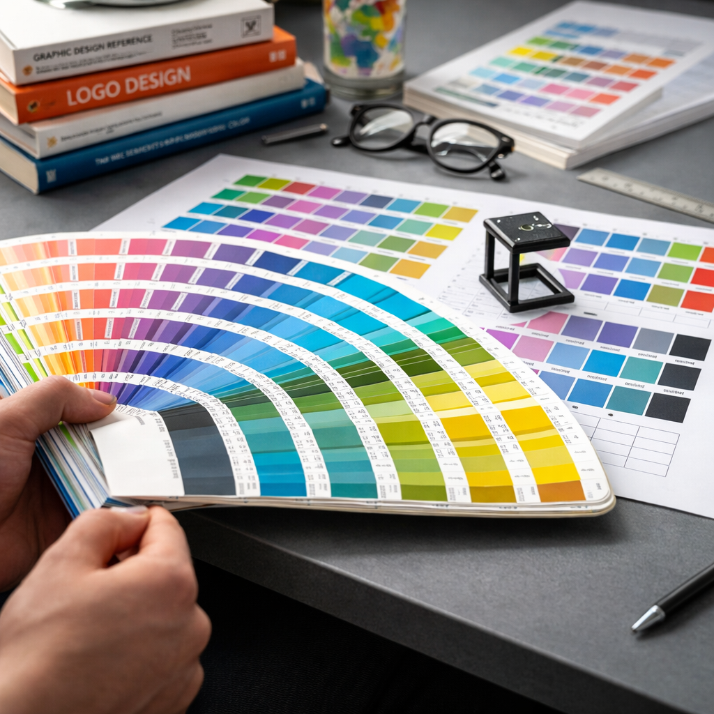
As a brand designer, I’ve seen this happen many times. Especially in high-pressure situations, like preparing print materials for events. Deadlines are tight. Files are rushed. And suddenly, what looked perfect in Figma or Illustrator doesn’t match what comes out of the printer.
Why digital colors don’t translate perfectly to print
The core issue is simple: screens and print use completely different color systems.
Digital design works in RGB, a light-based system. Colors are created by emitting light, which allows for brighter, more saturated tones.
Print works in CMYK, an ink-based system. Colors are created by layering pigments on paper. This naturally reduces vibrancy and limits the available color range.
Some colors simply don’t exist in print the way they do on screen. Neon greens, intense blues, highly saturated gradients. These often shift, flatten, or lose depth.
There are also material variables. Paper type, coating, and printing technique all influence how color appears. A matte paper absorbs more ink and dulls colors. A glossy finish reflects light and enhances contrast. The same file can look different across print runs.
Common problems that appear in print
Colors look less saturated than expected. What was vibrant on screen becomes muted on paper.
Dark tones lose detail. Blacks can appear washed out or, if overcorrected, overly heavy and flat.
Brand colors become inconsistent across materials. Especially when multiple suppliers or print houses are involved.
Gradients band or break. Subtle transitions that look smooth digitally can appear stepped or uneven in print.
Unexpected color shifts. Blues turning slightly purple. Reds becoming brownish. Whites appearing off-white depending on the paper.
The story behind the habit
I remember one particular event where everything had to come together in less than 48 hours. We had banners, brochures, badges, and large-format prints all going into production at the same time.
Everything looked perfect digitally. Clean layouts, strong brand colors, consistent hierarchy.
But I’ve been through this enough times to know that “perfect on screen” means nothing until you see it printed.
So I asked for quick print samples before approving the full run. Even though we were already behind schedule.
And that’s where the issue showed up.
The main brand color, a deep teal, printed significantly darker. On the matte paper selected for the brochures, it lost contrast and made the typography harder to read. On the banners, printed on a different material, it looked completely different again.
If we had gone straight to full production, we would have ended up with inconsistent materials across the entire event.
Instead, we adjusted the CMYK values, slightly lifted the brightness, increased contrast for text, and aligned all materials to the same print profile.
It delayed us by a few hours. It saved the entire visual consistency of the event.
Since then, I never skip this step. No matter how tight the timeline is.
How to avoid these problems
Start with print in mind, not as an afterthought. If a brand will live in physical formats, define CMYK values from the beginning, not just RGB or HEX.
Always convert and test your colors. What you see after conversion is often already different. Adjust intentionally rather than accepting automatic conversions.
Request print samples. Even small ones. Especially for key brand colors. This is the single most effective way to catch issues early.
Use color profiles consistently. Align your files with the printer’s specifications. Small mismatches in profiles can lead to noticeable shifts.
Be mindful of materials. Paper and finish are part of the color system. A color is not just ink, it’s ink plus surface.
Avoid extreme colors if consistency is critical. If a brand relies heavily on highly saturated digital colors, expect compromises in print and plan for them.
Define a print color system in your brand guidelines. Not just “approximate” values, but tested, reliable ones that have already been validated in real conditions.
The mindset shift
The biggest mistake is treating print as a direct extension of digital.
It’s not.
It’s a different medium with different rules. And it requires the same level of design intention.
The difference between a brand that feels consistent and one that feels slightly off often comes down to this invisible layer of discipline. The willingness to test, adjust, and respect the constraints of each medium.
Because in the end, people don’t experience your brand in RGB or CMYK.
They experience it as a feeling of coherence.